How to apply the principles of interior design to your new home
We asked interior designer Katie Gordon, who runs Kreative Living, in Penrith, for some insider tips on the basic principles of interior design.

Applying the basic principles of interior design
Interior designers think about a collection of core principles when they imagine how to turn a room into a fantastic space. We can all bear them in mind when it comes making our house into a home.
The basic principles of interior design are ‘tools’ we use to develop ideas on how a space should be designed. They are balance, rhythm, emphasis, proportion and scale and harmony. The question is how we implement these principles into design.
It’s all about balance
Having the right balance of objects in a room is absolutely essential to making sure it is functional and comfortable. The last thing you want is for the place to feel cluttered, but a room that’s too sparse and empty sometimes isn’t right either.
“Balance is achieved by careful placement of all the objects in the room,” says Katie.
“You might think that to create this you need a symmetrical layout, but this is not the case, an asymmetrical layout can be more interesting, and balance is created though distributing items with a similar visual weight. All other elements also contribute to the balance of a room.”

Have you got rhythm?
Although the elements of a room are made up of individual objects, the feel of each item will be determined by how they interact with each other. It’s similar to how individual instruments in a band might sound OK when they’re playing on their own, but sound a lot better when they all come together. This aspect of interior design is known as rhythm.
“Rhythm is a visual movement that joyfully guides your eye around the space, this will engage the user and determine how the space feels,” says Katie.
“There are different ways to create rhythm; repetition, by repeating any of the elements of design, for example repeating colours; alternation, by alternating two or more elements in a regular pattern; progression, graduating objects, for example from small to large.”
Give it some emphasis
Even though every part of a room is important, there needs to be a central feature that everything else is built around.

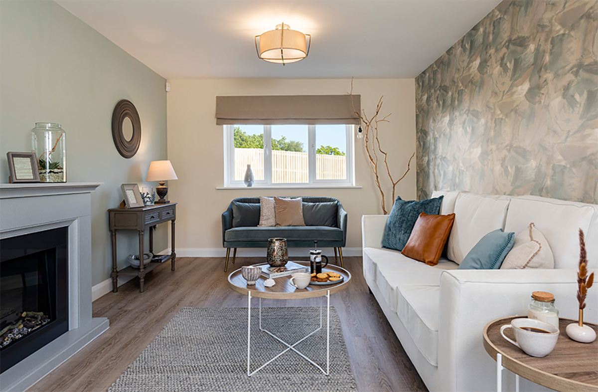
Emphasis is creating a focal point which attracts the eye A room may already have a focal point such as a window or a fireplace, if not you can create one with statement art or a feature wall with decorative wallpaper.
Get things in proportion
Proportion and scale are an essential principle of interior design. We’ve all had that feeling when a particular piece of furniture or decoration becomes ‘too much’, but interior designers have a handy guide they use to ensure this doesn’t happen.
“The 60/30/10 rule can be applied to this element. These are ratios set out to ensure that objects and space work in proportion and create a successful space,” says Katie.
“An example for applying the rule to room proportions would be to fill 60 per cent of the room with furniture, 30 per cent left empty as walking space and 10 per cent with decorative items.
Sweet harmony
Finding harmony in a room goes right back to the planning stage, when it’s important to look at the items and decor you’re considering and make sure they don’t clash. There needs to be a common theme that runs through the look and feel of everything.
“Harmony is created by using similar elements which complement each other. An example of this is to use the common element of shape, colour, or texture,” says Katie.